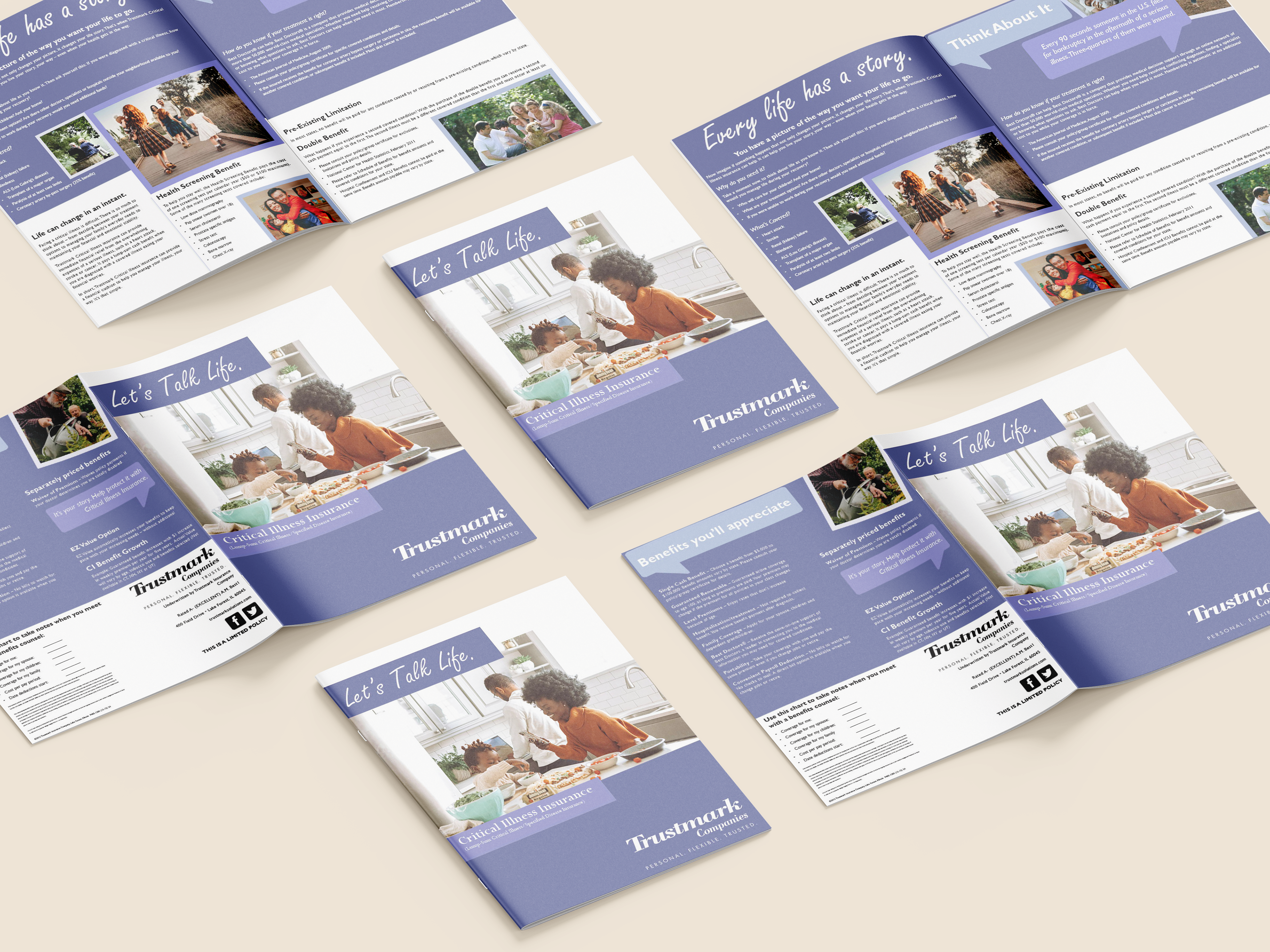
This project is a booklet design for Trustmark, focused on creating a clear and approachable identity for critical insurance information. I used a clean layout, soft color palette, and structured typography to make the content feel easy to navigate and less overwhelming. The use of imagery helps humanize the information and connect it to real-life situations.
The design is carried across multiple spreads and printed materials, maintaining consistency through color, type, and layout choices. I focused on balancing readability with visual interest to keep the booklet engaging while still informative. Overall, this project explores how thoughtful layout and branding can improve the communication of complex information.