
Problem
Monster Cake Co. needed a full brand identity for a bakery that sells cakes and pastries. The goal was to create something fun, eye-catching, and easy to recognize, while still being flexible enough to work across packaging, social media, and stationary. The brand needed personality without feeling messy or overly childish.
Research / Strategy / Design Decisions
I started by exploring the overall tone and direction of the brand, focusing on how it should feel and who it’s for. I wanted the identity to come across as playful, bold, and memorable, while still being clear and easy to use across different formats.
From there, I moved into sketching and developed a wide range of logo ideas. I experimented with both mascot-based concepts and type-only designs to see what best fit the brand. The logo went through many revisions during this stage—adjusting shapes, simplifying details, and reworking different ideas. Many of these versions didn’t work because they felt too generic, too complex, or didn’t capture the fun, slightly quirky personality I was aiming for. This process of refining and reworking helped me narrow things down and eventually land on a stronger direction.
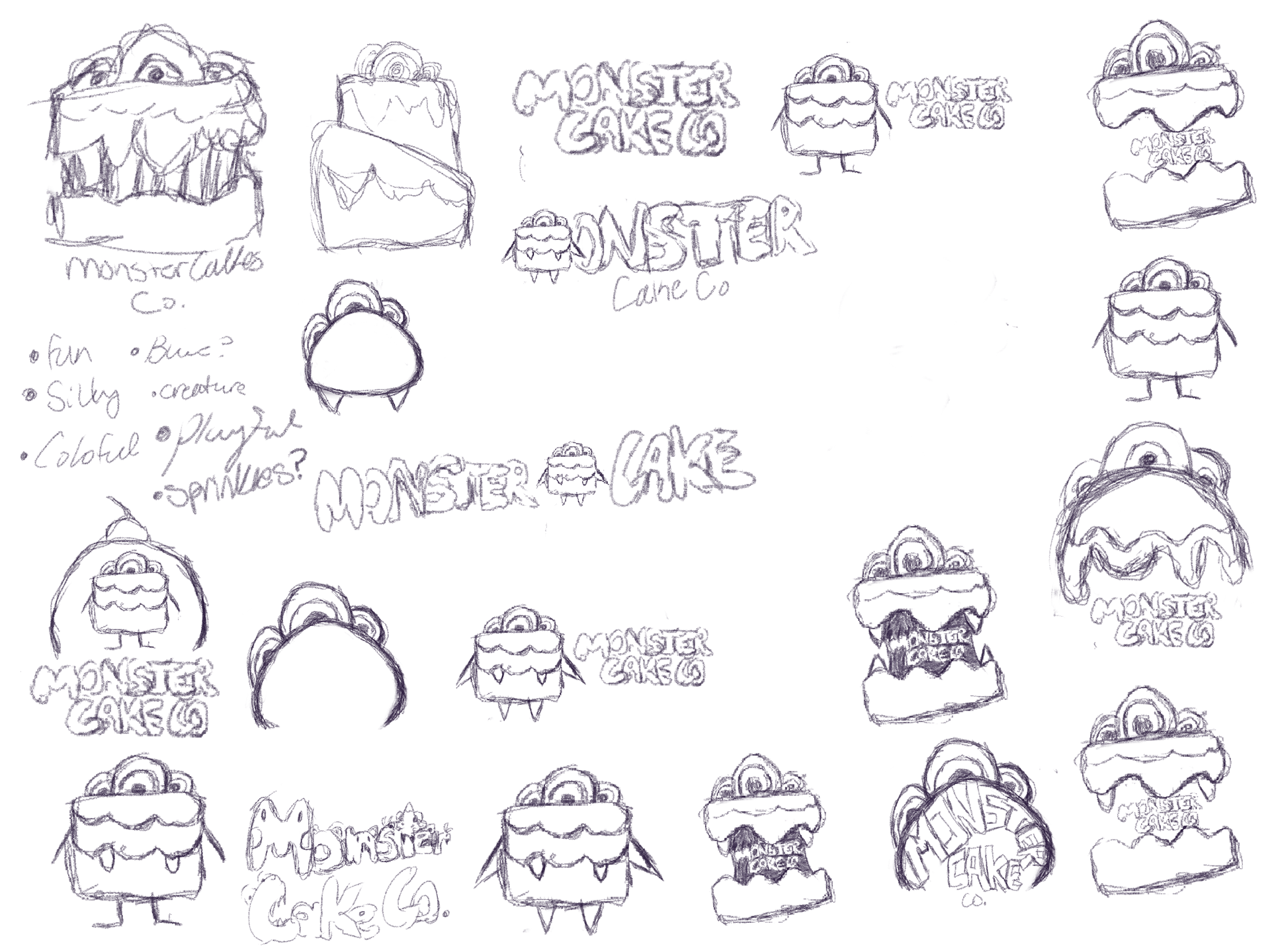
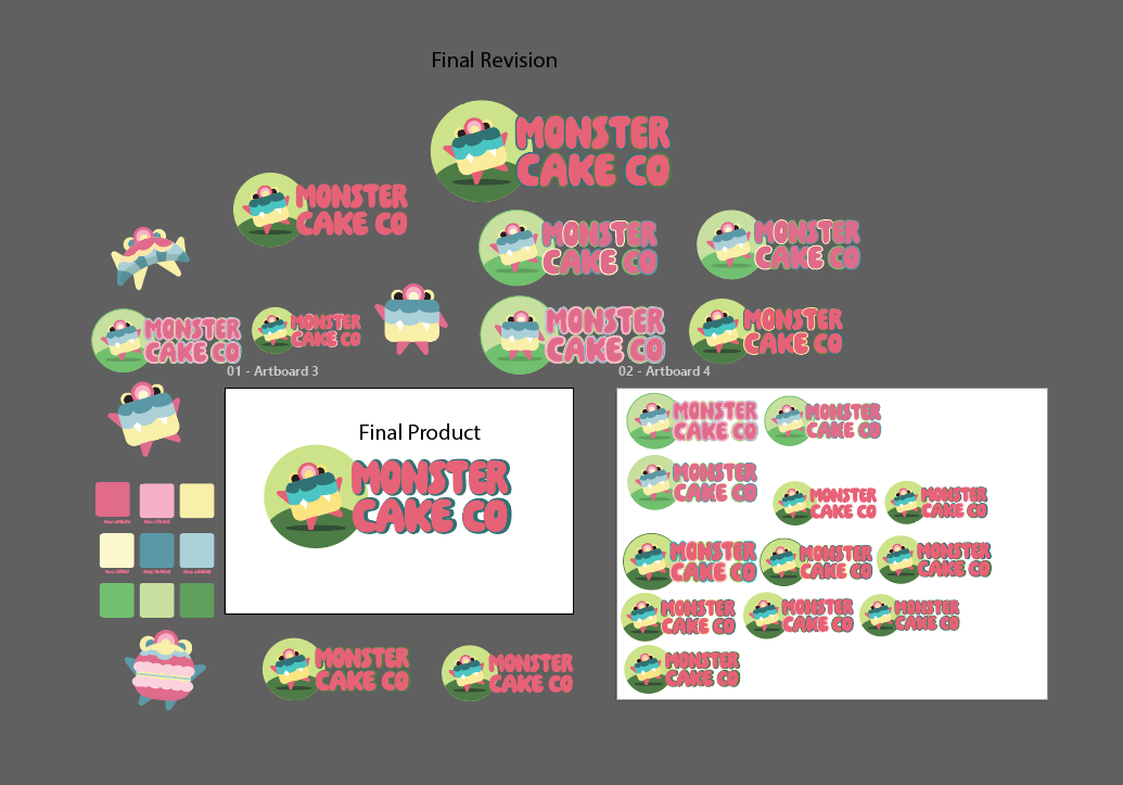
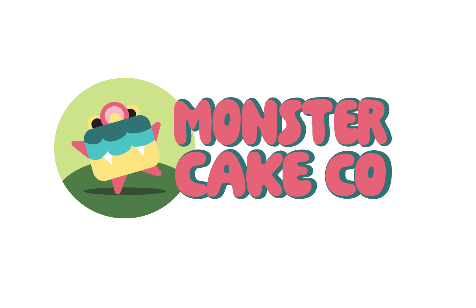
The most successful concepts combined a simple monster character with bold, rounded typography. This approach gave the brand a strong personality while still keeping it clean and usable. After choosing this direction, I refined the logo in Adobe Illustrator, focusing on balance, shape, and clarity.
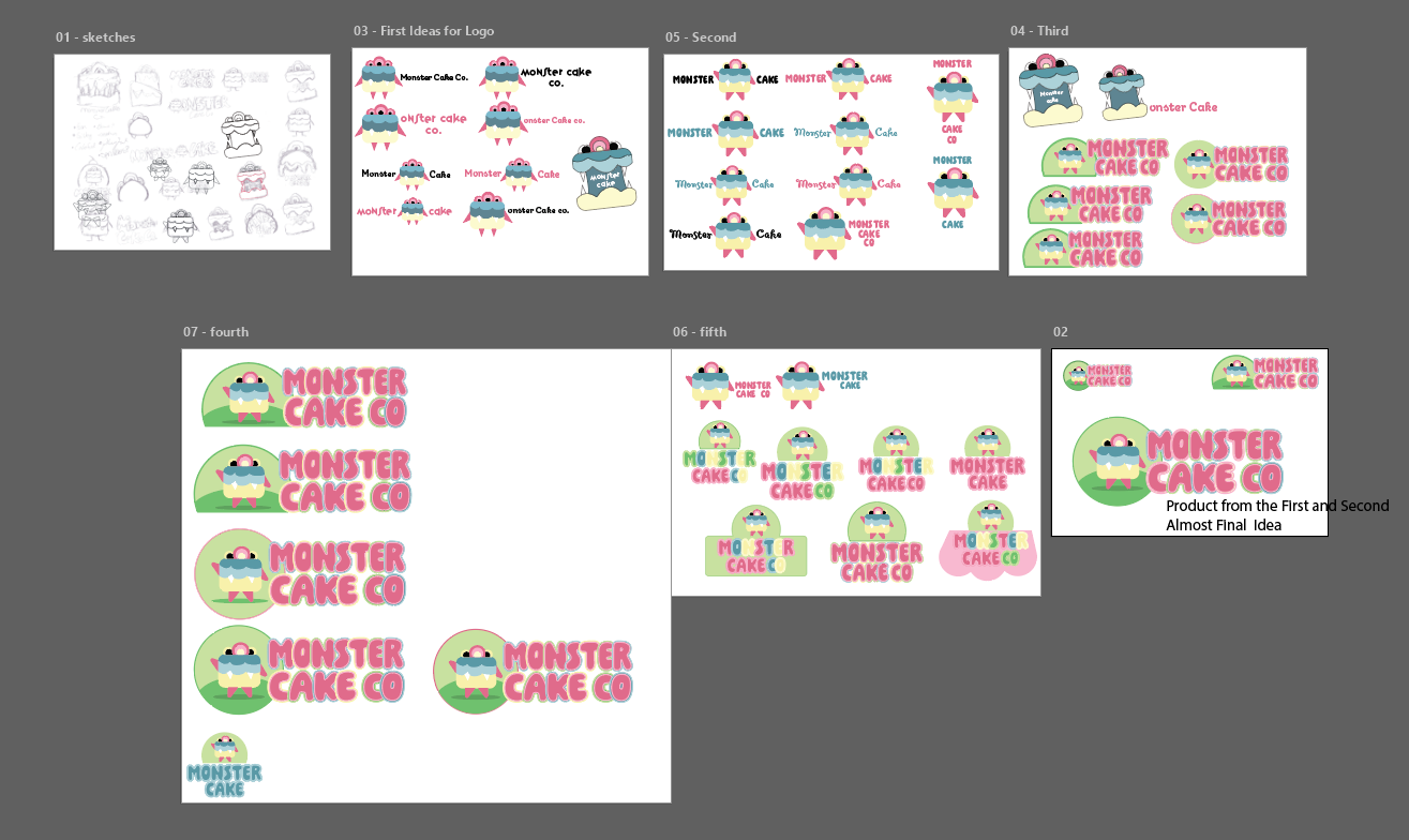
I then explored typography and color to support the concept. I tested different fonts before selecting one that felt friendly and easy to read, paired with a simpler font for body text. The color palette was built around soft pastel tones inspired by desserts, with brighter accents to keep the brand feeling lively. The monster character and color palette became the most recognizable parts of the identity and helped tie everything together.
Stationery
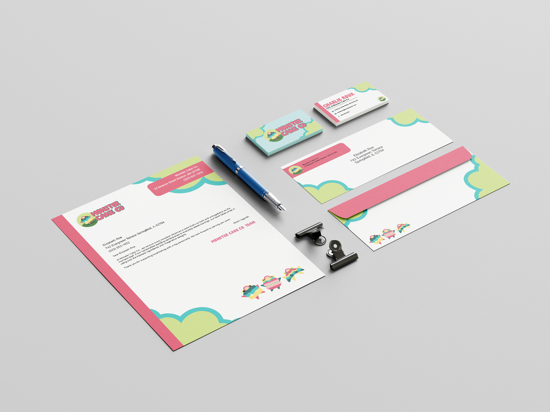
I first applied the brand to stationery by building out the designs in Adobe Illustrator and InDesign, using this stage as a way to test my first idea for the stationery system. This included items like business cards, letterheads, and envelopes. In this first version, I used a sprinkle pattern and lighter color combinations across most of the layouts. However, after seeing everything together, it felt too busy and the colors didn’t stand out as much as I expected. The pattern was overpowering the layout and making the information harder to read.
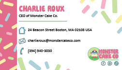
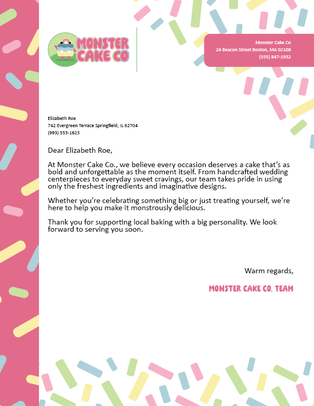
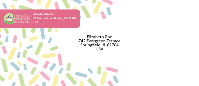
After reviewing this first idea, I went back and revised the designs. I reduced how much the pattern was used and switched to more saturated colors to create stronger contrast. This helped the layouts feel cleaner and made key elements like the logo and text stand out more clearly.
I also redesigned the business cards and other stationery pieces to improve hierarchy and spacing. The updated versions use more controlled layouts, with better placement of the logo and a more balanced use of color. The mascot is used more selectively so it supports the design instead of distracting from it.
These changes made the stationery feel more polished and easier to read, while still keeping the playful personality of the brand.
Packaging
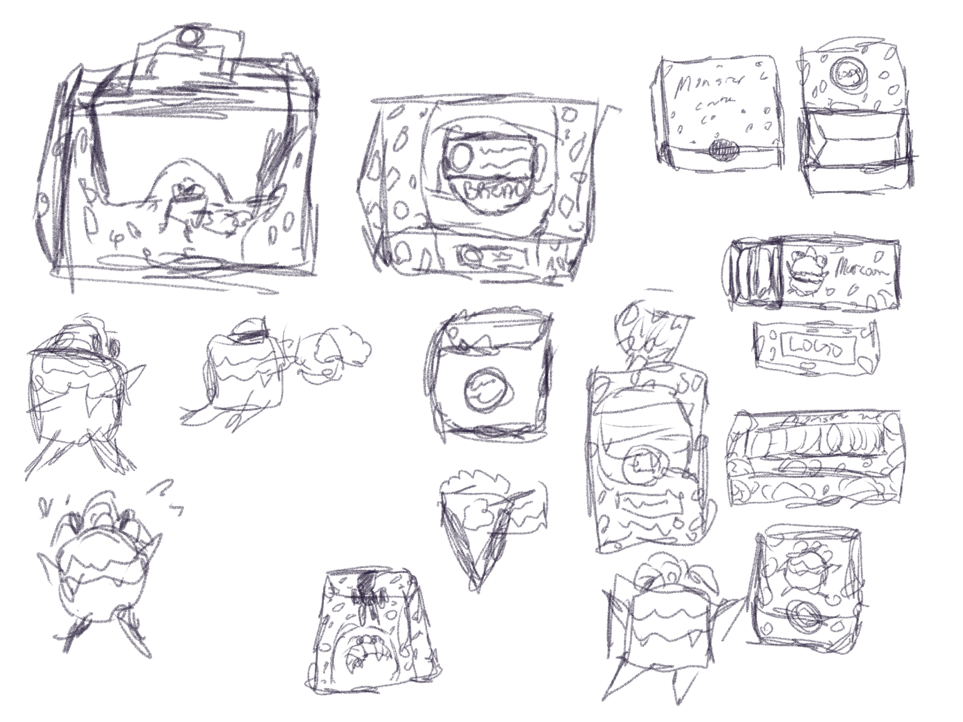
I started the packaging by sketching ideas for different formats, including a cake box, a macaron box, and a takeaway bag. This helped me figure out how the logo, mascot, and patterns would sit across different shapes and surfaces, and how the design would wrap around each item.
After sketching, I moved into creating and finding mockups so I could test the designs in a more realistic way. Seeing the cake box, macaron box, and bag together helped me understand how consistent the system felt and where adjustments were needed. It also showed me how scale, color, and placement changed depending on the size and format.
From there, I refined the designs in Illustrator, focusing on how I wanted each piece to look as a final product. I pushed the playful side of the brand by using larger versions of the monster mascots, brighter color combinations, and sprinkle-inspired patterns. Each item uses the same visual language, but in slightly different ways so they don’t feel repetitive.
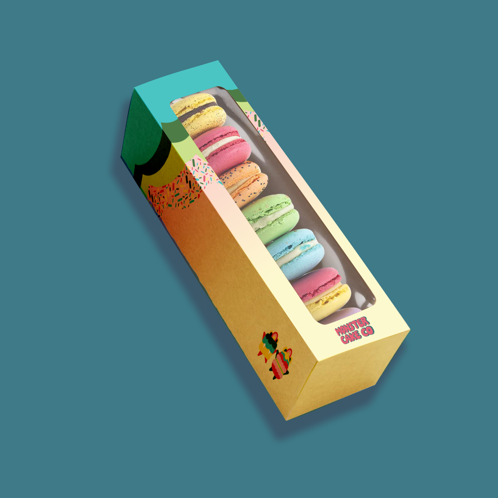
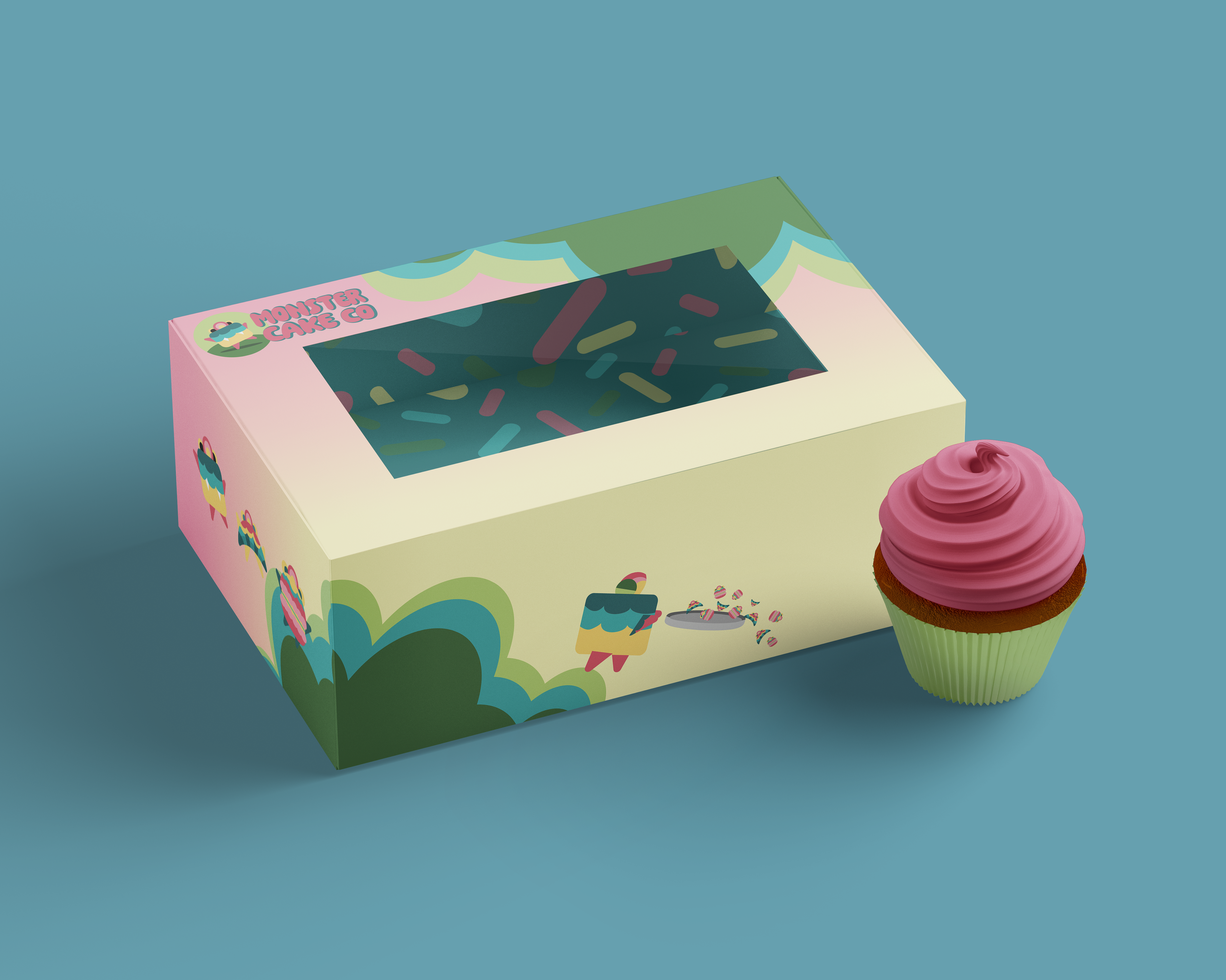
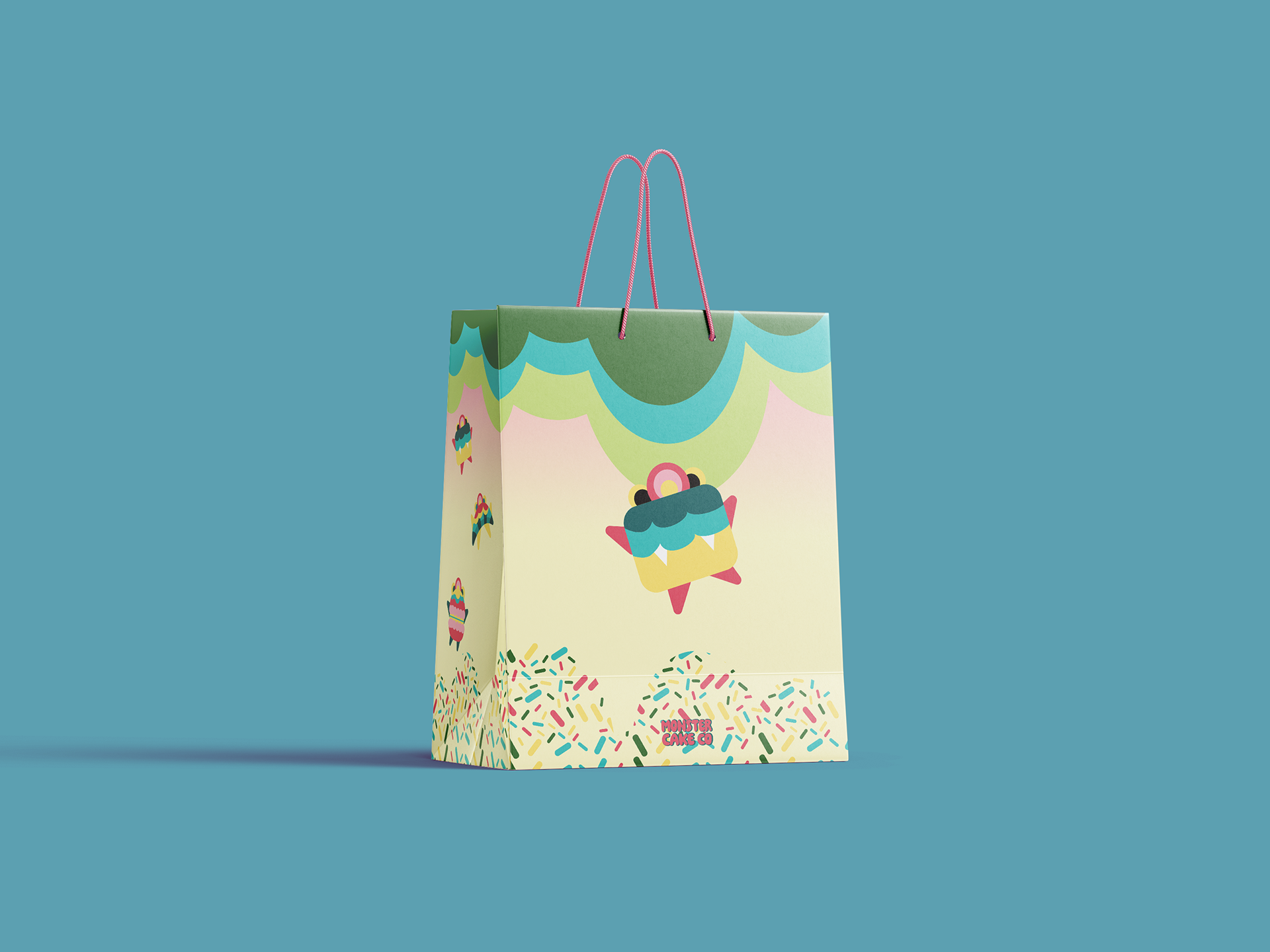
The cake box uses bigger areas of color and illustration to make it stand out, while the macaron box focuses more on showcasing the product with a clear window and supporting graphics. The bag is more simplified, with bold logo placement and color blocking so it’s easy to recognize when carried around.
At the same time, I made sure everything was still practical. The logo and key information are easy to see, and the designs don’t feel overcrowded. Overall, the packaging works as a system while still allowing each item to feel considered and intentional.
Central Idea
The main idea behind the brand is to make desserts feel fun and full of personality. This started with the logo, where I explored different ideas before landing on a simple monster character paired with bold, rounded type. The monster represents indulgence and play, which became the foundation for the rest of the brand. Everything builds off this idea to make Monster Cake Co. feel approachable, memorable, and a bit playful.
Why This Approach Works
A lot of bakeries either feel very clean and elegant or overly cute. This brand sits in between. The monster mascot adds personality, while the simple layouts and clear type keep everything easy to read and use. This balance works across the logo, stationery, and packaging, making the brand feel consistent without being overwhelming.
Visual Expression
The visual style grows directly from the logo. The monster mascot is used across stationery and packaging, sometimes as the main focus and sometimes as a supporting element. A pastel color palette inspired by frosting and sweets is used throughout, with more saturated colors added where needed for contrast. Rounded shapes, soft edges, and sprinkle patterns help keep everything feeling connected and playful.
The System
The brand is built around a set of core elements that stay consistent across all applications. A bold, rounded font is used in the logo and headings to give the brand personality, while a simpler font is used for body text to keep everything easy to read. The color palette is based on soft pastel tones, with brighter, more saturated colors added to create contrast and help certain elements stand out. Layouts are generally clean and structured, especially in stationery where readability is important, while packaging allows for more playful and expressive use of space.
Across all designs, there are a few consistent rules that help tie everything together. Rounded shapes and soft edges are used throughout to match the friendly tone of the brand. Sprinkle patterns are included as supporting elements, but used in a more controlled way so they don’t overwhelm the layout. The logo and monster mascot are applied consistently across stationery and packaging, sometimes as the main focus and other times as a smaller supporting detail. These repeated elements help create a system that feels cohesive while still being flexible.
How It All Works Together
The logo sets the tone, and everything else builds from it. Stationery uses a more controlled and simplified version of the system, while packaging pushes the colors and mascot further. Even with these differences, the same elements repeat, so everything still feels like part of one brand.
The logo sets the tone, and everything else builds from it. Stationery uses a more controlled and simplified version of the system, while packaging pushes the colors and mascot further. Even with these differences, the same elements repeat, so everything still feels like part of one brand.
Challenge
One challenge was making sure the brand stayed playful without becoming too busy or childish. This came up especially in the stationery, where early designs used too much pattern and softer colors. By simplifying layouts and increasing color contrast, the designs became clearer and more balanced.
Objective
Create a brand that feels fun and recognizable, while still working across different formats like stationery and packaging without losing consistency.
Outcome
The final result is a cohesive brand identity built from a strong logo and carried through into stationery and packaging. Each application uses the same core elements but in slightly different ways, making the brand feel consistent, flexible, and easy to recognize.