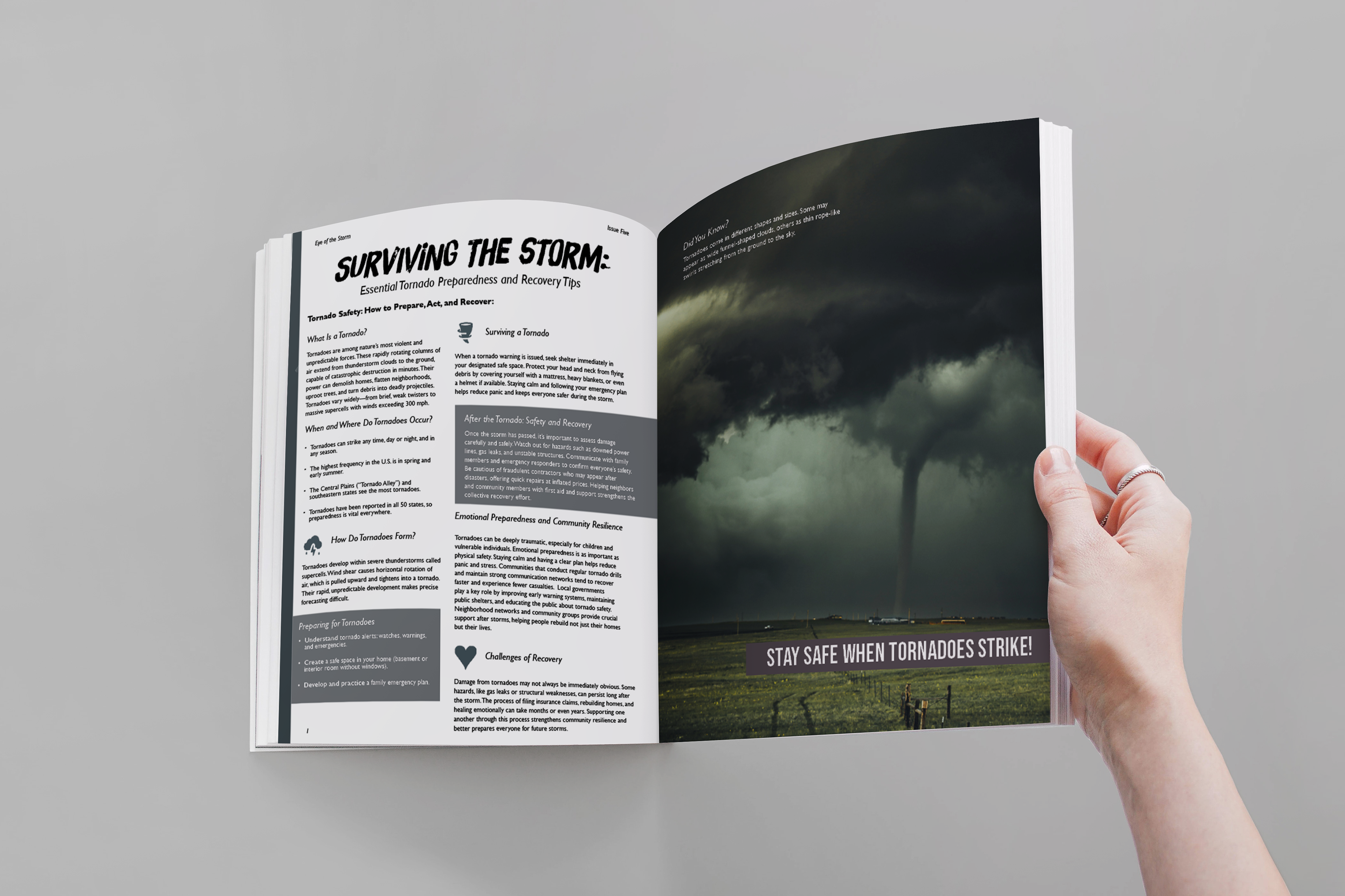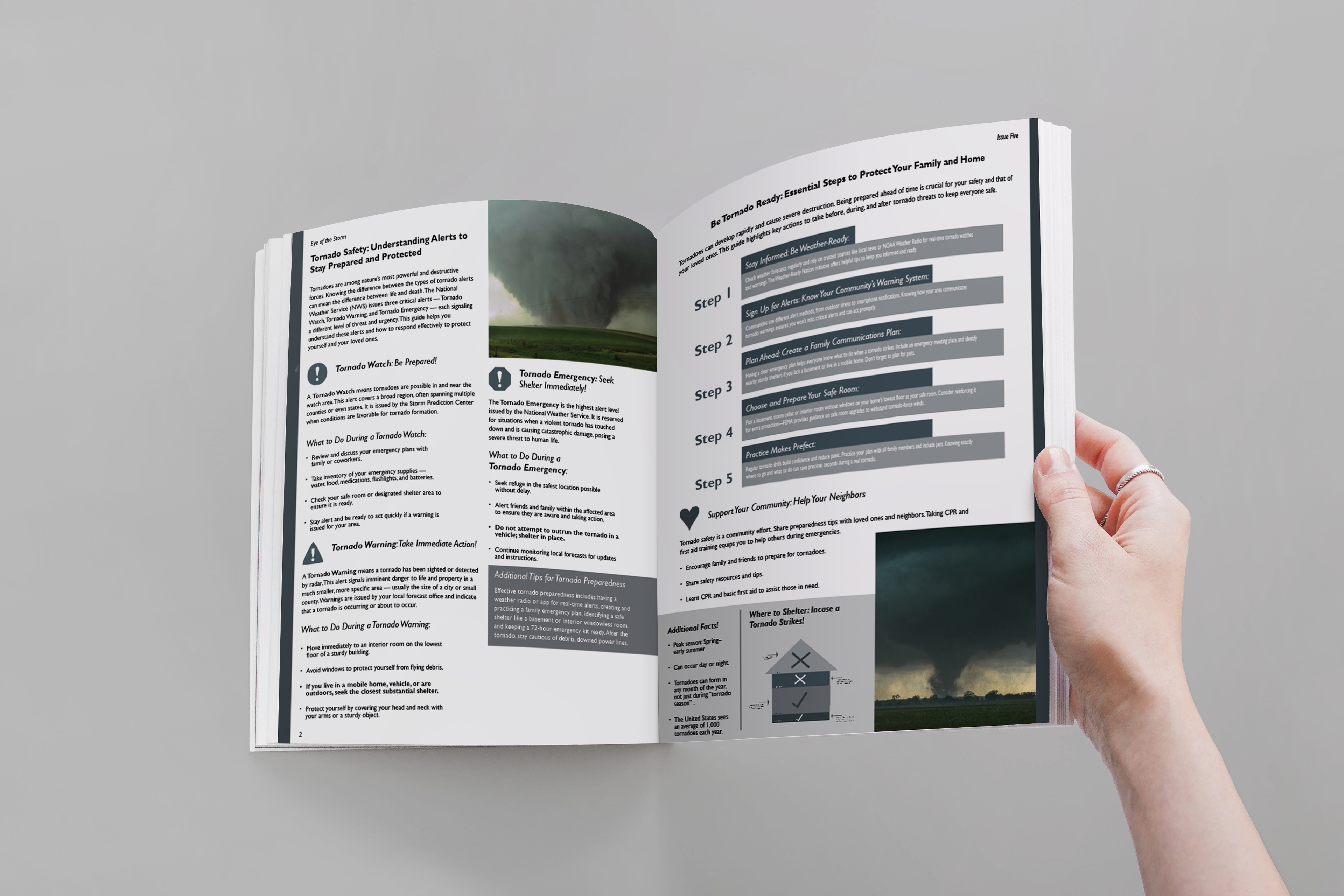
This editorial spread focuses on tornado safety and awareness, combining strong visuals with clear, organized information. I wanted to create something that feels both serious and engaging, so I used a dramatic storm image to immediately grab attention and set the tone. The layout is structured to guide the reader through important safety tips in a way that’s easy to follow, using hierarchy, icons, and contrasting sections to break up the text.
I also paid close attention to typography and spacing to make sure everything stays readable while still feeling visually interesting. The darker color palette helps reflect the intensity of the subject, while lighter elements and infographics balance it out and keep it from feeling too heavy. Overall, this project was about finding that balance between design and functionality—making sure the information is not only visually appealing but also useful and accessible.